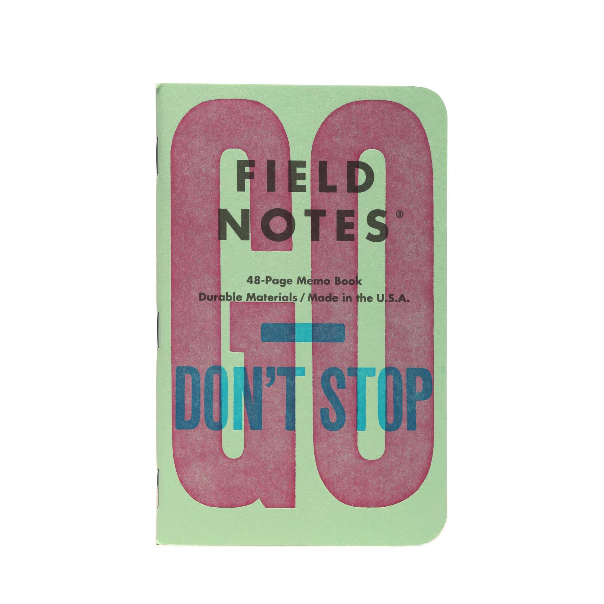
Field Notes United States of Letterpress Pack B (3-Pack, graph)
$17.50 CAD
Unit price
/
Unavailable
$17.50
Couldn't load pickup availability
FREEDOM OF THE PRESSES
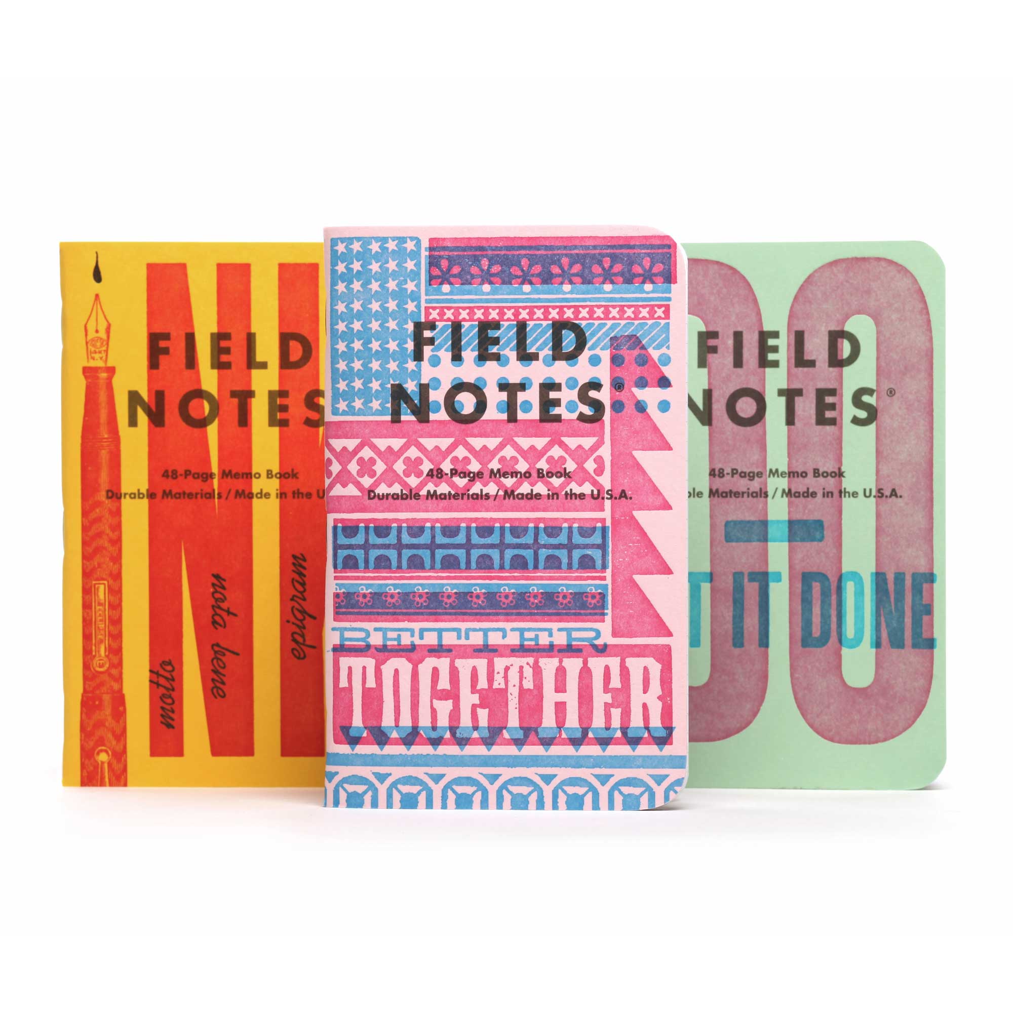
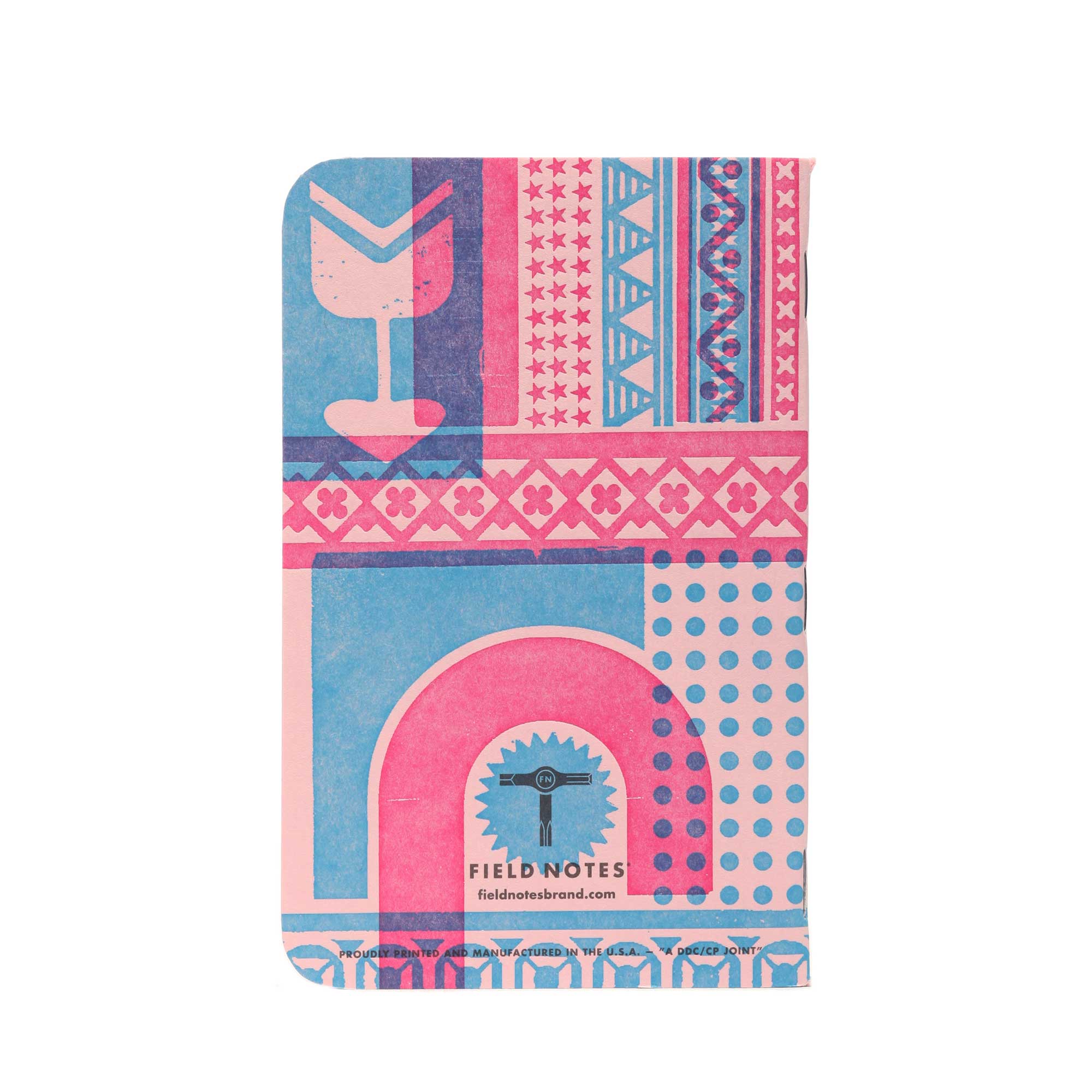
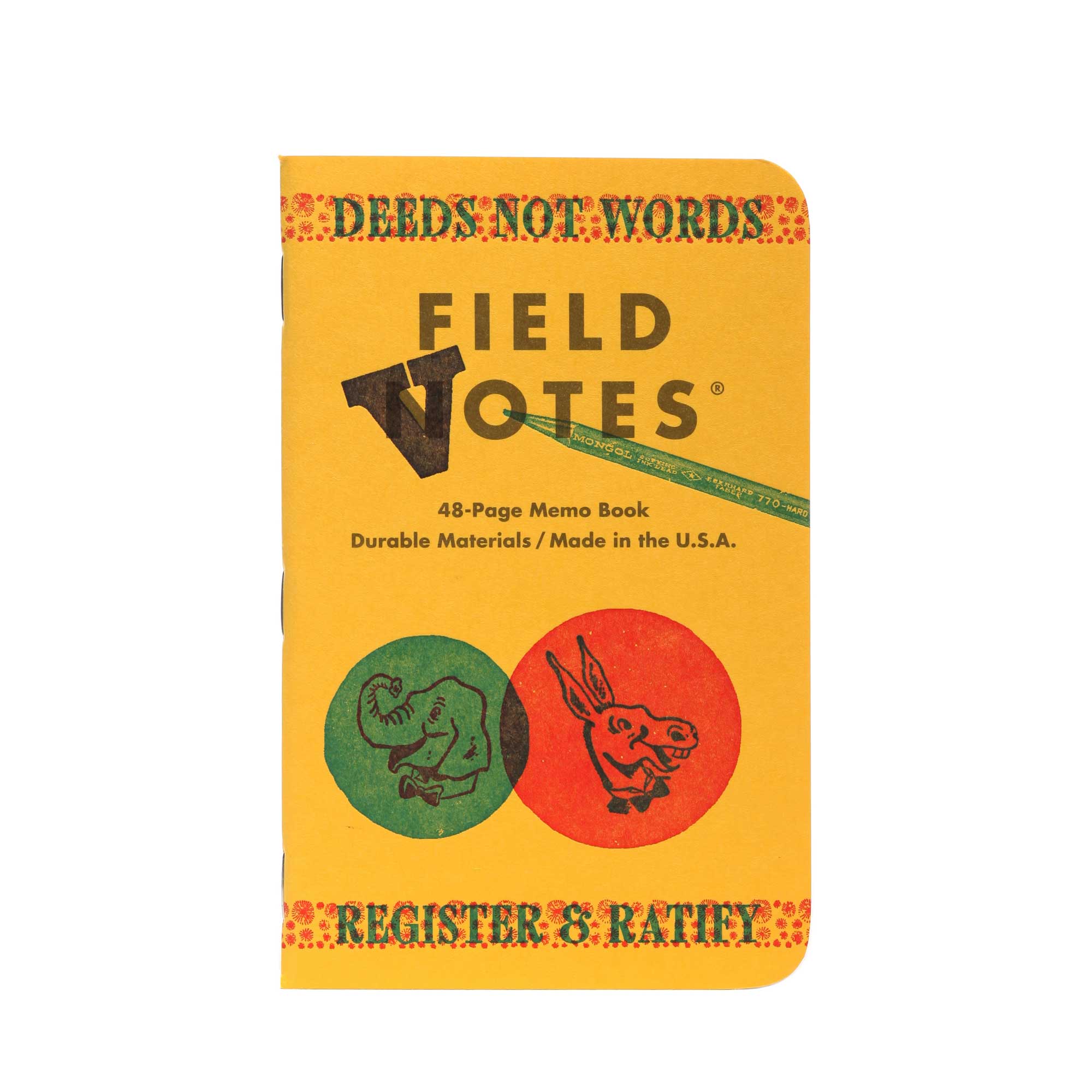
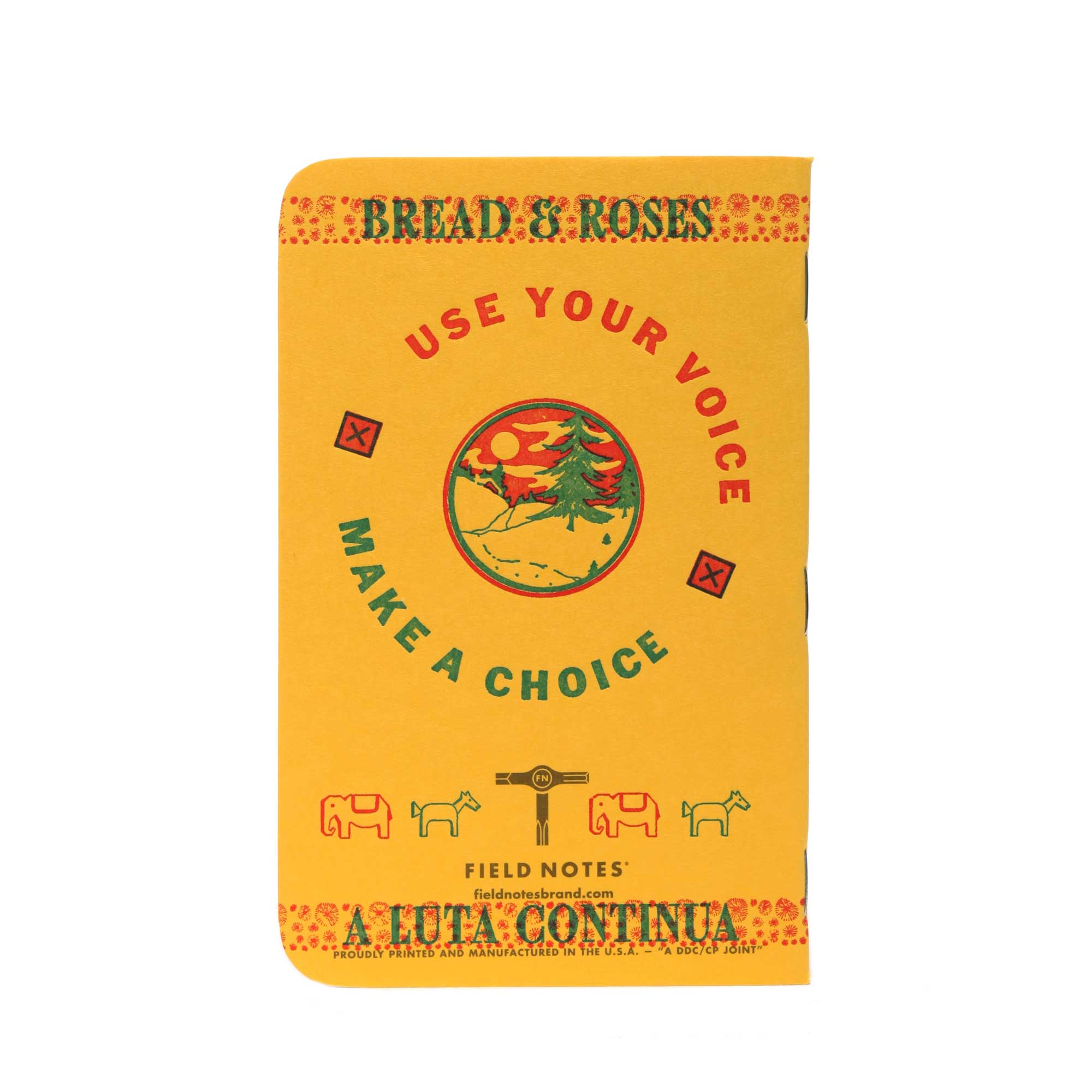
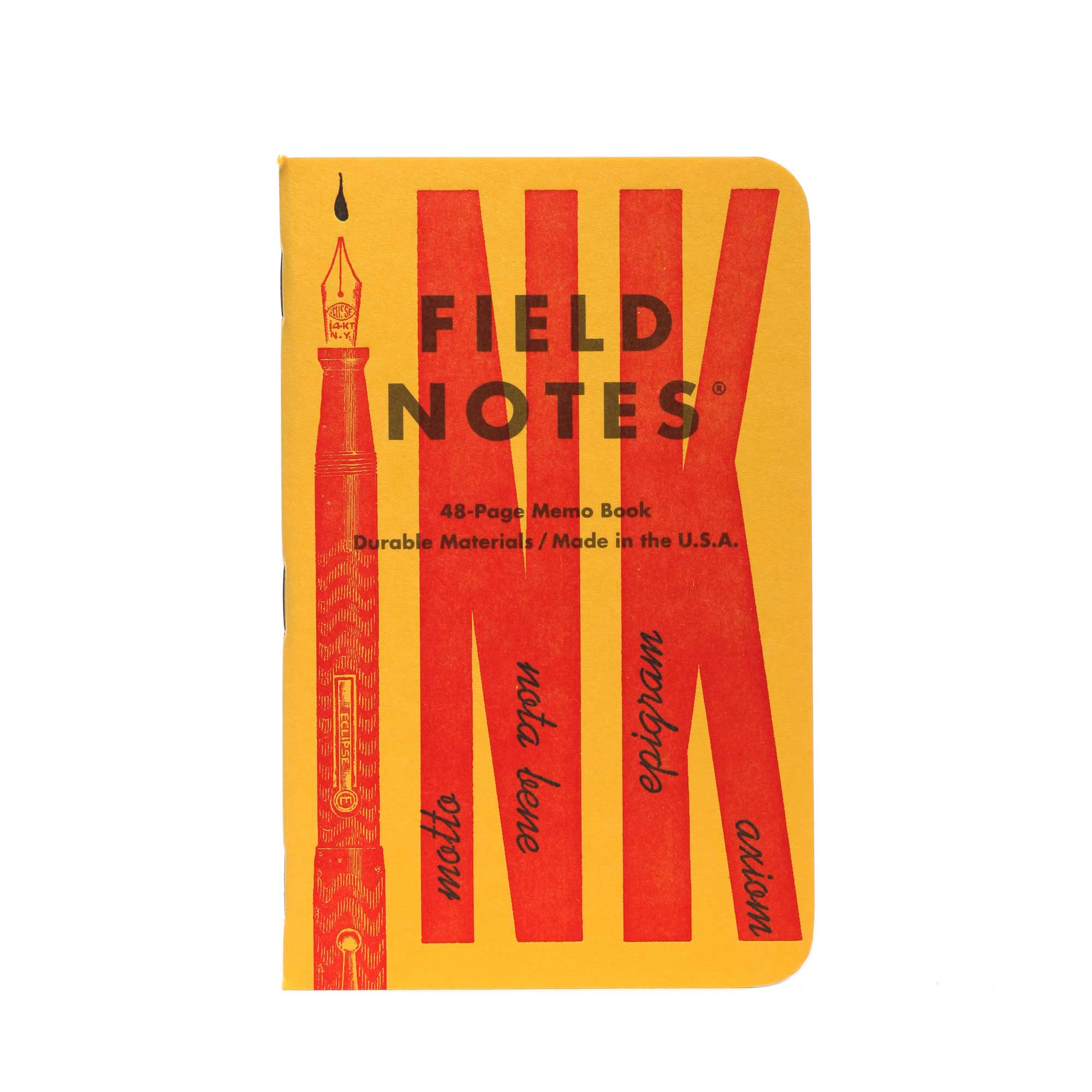
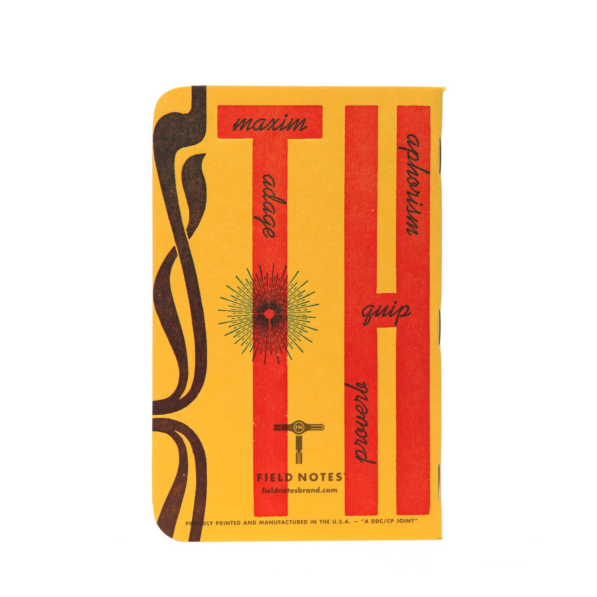
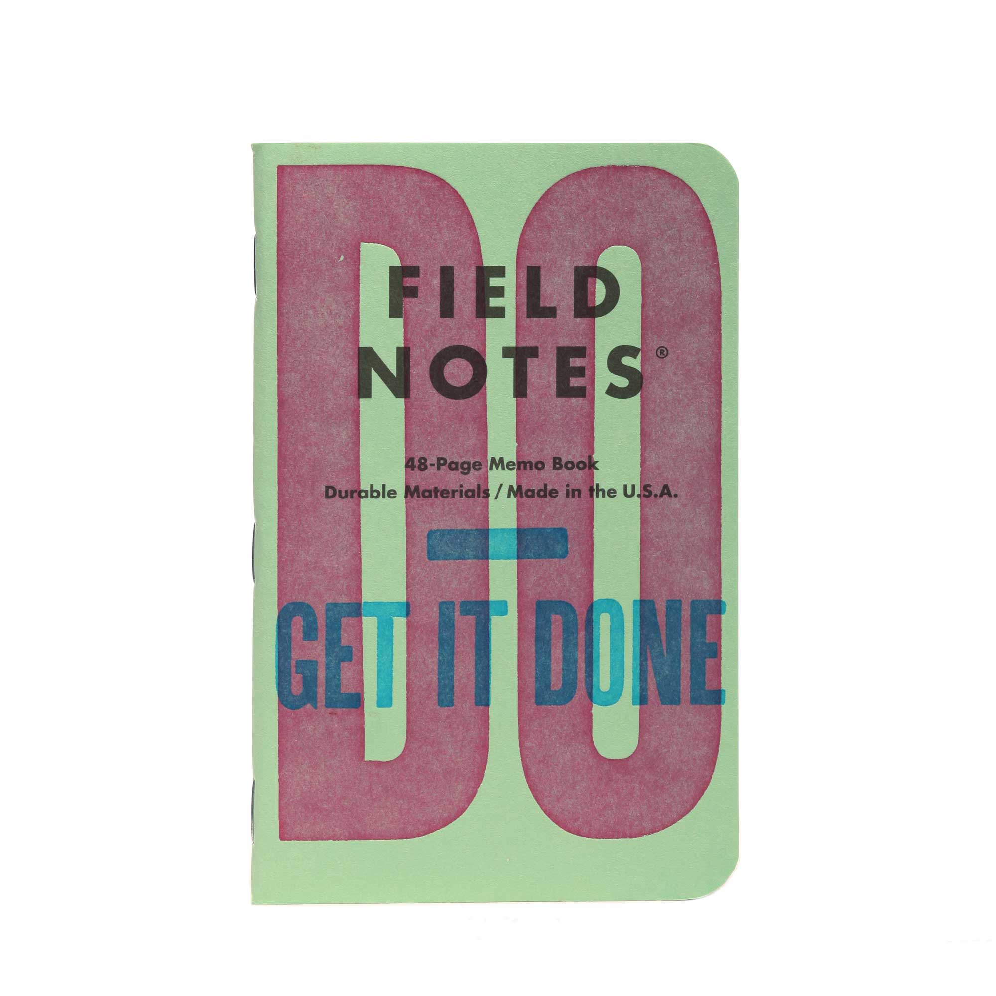
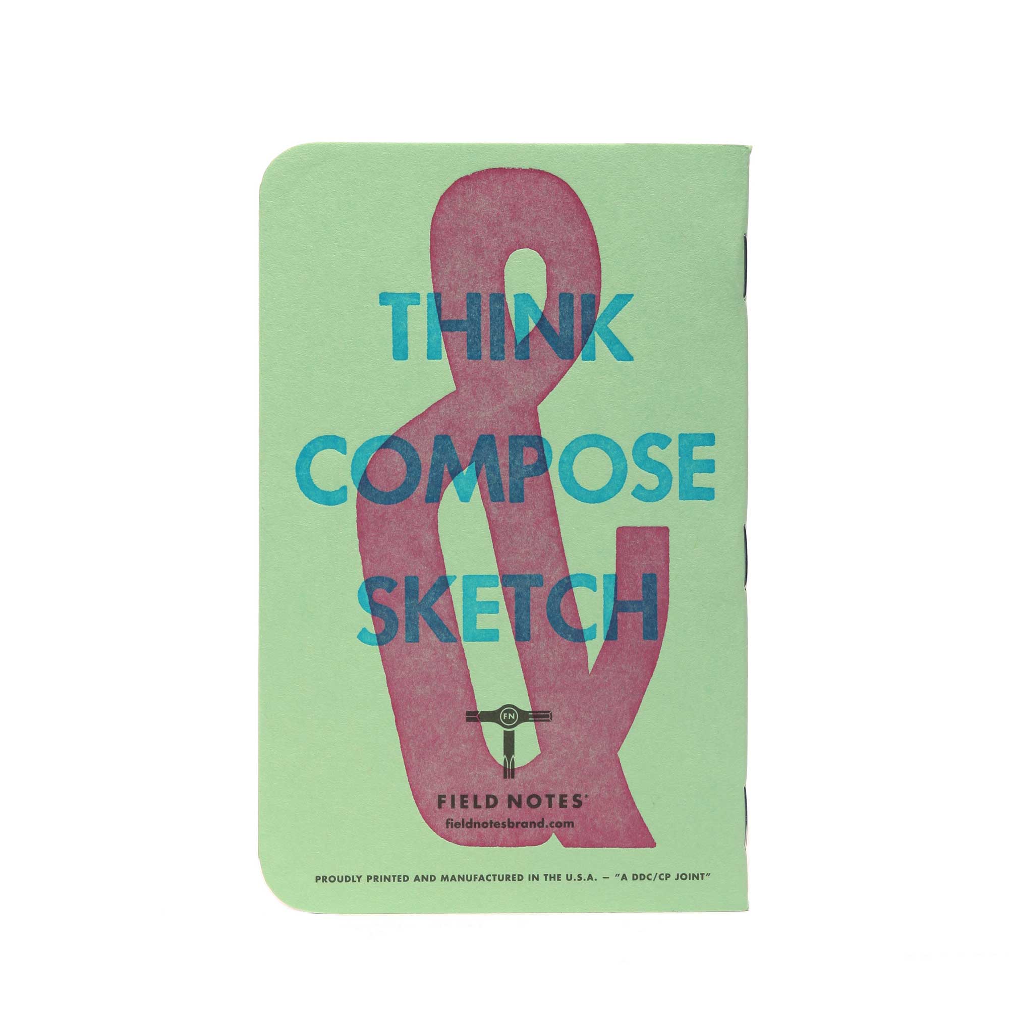
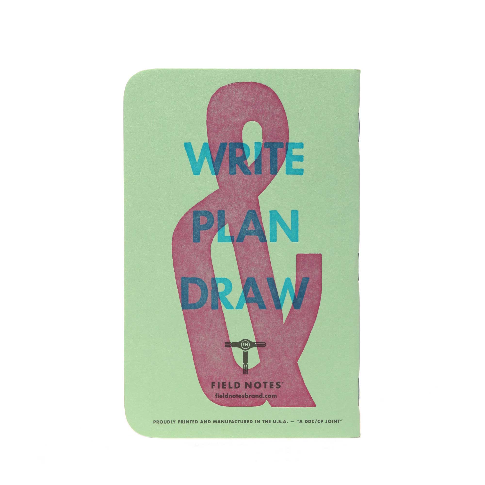
Our 48th Quarterly Limited Edition for the Fall of 2020 is the “United States of Letterpress,” which features the work of nine independent letterpress shops from across America. This series demonstrates a wide array of craftsmanship, ingenuity, and love for the age-old and tactile process of letterpress printing.
With the help of our friends at Finch Paper of Glenn Falls, New York, and The French Paper Company of Niles, Michigan, we shipped each shop a different color cover stock (all from French’s Pop-Tone line) and specified the same two ink colors (Rhubine Red and Process Blue) for all of them. The results are as varied and thoughtful as the participants involved.
Continuing a tradition embossed into the history of American letterpress printing, the layouts, themes and messages are highly personal statements about heritage, geography, tradition, and social issues, and they also demonstrate the diversity and strength of today’s letterpress community.
In 2015, we released the “Two Rivers” Edition with The Hamilton Wood Type & Printing Museum of Two Rivers, Wisconsin, and we leaned on them this time too. With Hamilton’s help, we crafted a list of letterpress printers we wanted to work with. Luckily for us, they all said yes.
3-PACK A
Includes one cover designed by Full-Circle Press of Nevada City, California. One of two by Genghis Kern of Denver, Colorado. One of two by Mama’s Sauce of Orlando, Florida.
3-PACK B
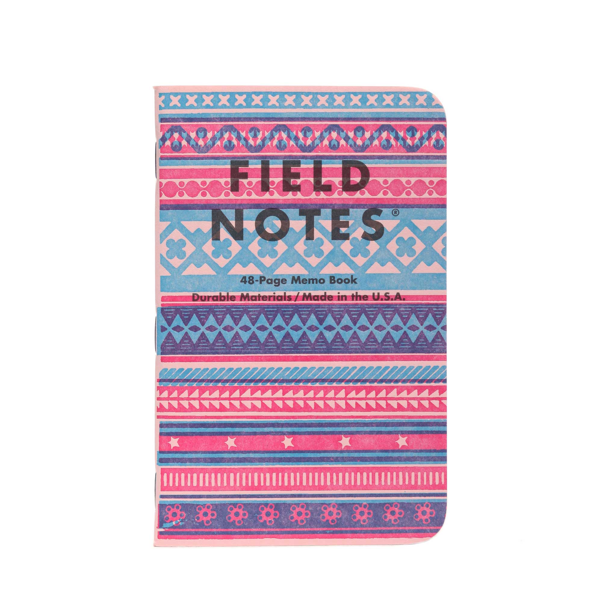
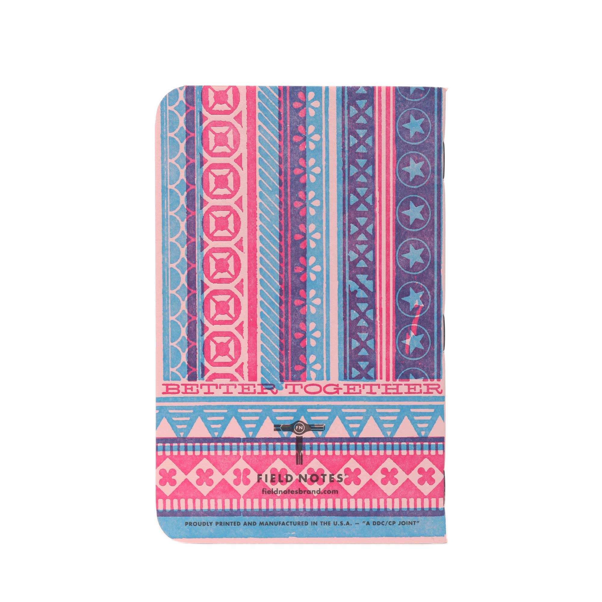
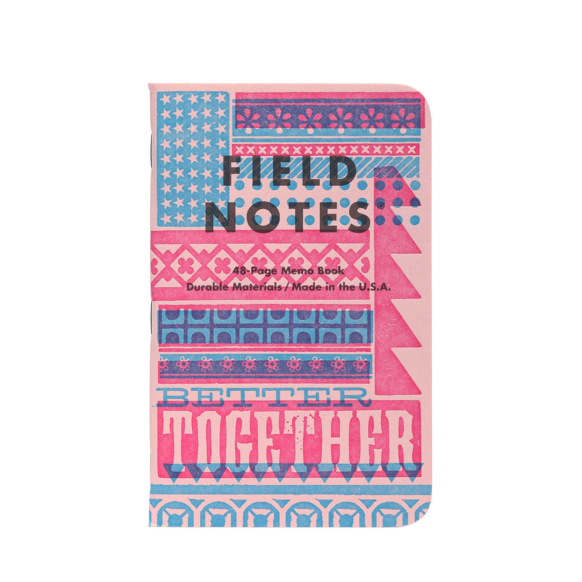
Includes one of two cover designs by Springtide Press of Tacoma of Washington, One of two by Brad Vetter of Louisville, Kentucky. One of two by Ben Blount of Evanston, Illinois.
3-PACK C
Includes one of two cover designs by Rick Griffith of Denver, Colorado. One of two by Erin Beckloff of Springboro, Ohio. One cover by Starshaped Press of Chicago, Illinois.
Skylab Letterpress of Kansas City, Missouri printed our designs for each book’s flyleaf, including a reproduction of a border from the Bay Psalms Book (1640), thought to be the very first book printed in the American colonies.
MILES COVERED
Lake County Press, of Waukegan, Illinois, pre-printed the Field Notes elements on the exteriors and interiors of the cover stock, which was then trimmed down from standard 26" x 40" press sheets to 8.5" x 13", with the art arranged 2-up on a sheet. We then shipped one color to each of the letterpress printers.
The printers utilized any and all methods at their disposal, with the only dictate being that they print a 2-color design using our specified red & blue inks.
The covers and flyleaf sheets were shipped back to LCP, where light tan Graph Grid interior pages, printed on Finch Opaque Smooth “Bright White,” were waiting. All the elements were then collated, bound, stapled, and cut, and the 3-Packs assembled.
This project was produced through the craft and creativity of twelve printers around the country, with the help, gumption, and know-how of countless others, passed down by job-printers, collectors, and hobbyists over the last several centuries.
THE PRESSES
Letterpress & Design
Genghis Kern, Denver, Colorado
Full-Circle Press, Nevada City, California
Mama’s Sauce, Orlando, Florida
Brad Vetter, Louisville, Kentucky
Springtide Press, Tacoma, Washington
Ben Blount, Evanston, Illinois
Erin Beckloff, Springboro, Ohio
Rick Griffith, Denver, Colorado
Starshaped Press, Chicago, Illinois
Additional Printing
Thomas Printers, Ogden Utah
Skylab Letterpress, Kansas City, Missouri
Lake County Press, Waukegan, Illinois
THE PAPER
This special Quarterly Release was made possible by the cooperation of Finch Paper of Glenn Falls, New York, and The French Paper Company of Niles, Michigan. Field Notes has had a long relationship with both of these American mills, and we’re grateful that they joined us in celebrating the letterpress community.
SPECIFICATIONS:
01.
Proudly printed by the good people of Lake County Press, Waukegan, Ill.
02.
Cover: Printed on 1 of 6 French Pop-Tone 100#C stocks with a thick, brute force, 1-color application of “Linotype Slug Gray” soy-based Superior ink. It was then sent to 1 of 6 Letterpress printers around the U.S.A. and smashed with a 2-color application of “Process Blue” and “Rubine Red” letterpress inks.
03.
Innards: Finch Paper Opaque Smooth 60#T “Bright White,” with a fine, 1-color application of “Double Knee Duck Canvas Light Brown” soy-based Toyo ink.
04.
Cover and innards printed on a Heidelberg Speedmaster XL 105 40" 6-color printing press, as well as various vintage presses (see flyleaf for more details).
05.
Bound with a Heidelberg Stitchmaster ST 270 5-pocket saddle stitcher with cover feeder/scorer & Rima RS 10S in-line stacker.
06.
Corners precisely rounded to a 3/8" (9.5mm) radius with a Challenge DCM double round-corner machine.
07.
Memo book dimensions are 3-1/2" × 5-1/2" (89mm × 140mm).
08.
FIELD NOTES uses only the Futura typeface family (Paul Renner, 1927) in its materials.
09.
All FIELD NOTES memo books are printed and manufactured in the U.S.A.

